布局
Mist 使用的是基于 Flexbox 的布局模型,并进行了一些扩展,基本上满足大部分的布局需要。
所有元素都可以使用布局属性,写在 style 里。
基本属性
width/height
指定元素的宽高,默认值为 auto。
auto: 根据元素的内容或子元素的尺寸自动计算length: 指定固定的尺寸
min-width/min-height/max-width/max-height
元素的最小/最大尺寸。
length: 元素的最小/最大尺寸
margin
元素的外边距,默认值为 0。
auto: 所有为auto的 margin 均分剩余空间length: 指定固定的尺寸
注意,当指定为百分比时,无论是左右边距还是上下边距,其百分比都是相对父容器的内容宽度(即减去 padding)。
margin-top、margin-bottom、margin-left、margin-right 分别设置上、下、左、右边距。margin 设置四个方向边距为同一个值。
padding
元素的内边距,默认值为 0。
length: 指定固定的尺寸
注意,当指定为百分比时,无论是左右边距还是上下边距,其百分比都是相对父容器的内容宽度(即减去 padding)。
padding-top、padding-bottom、padding-left、padding-right 分别设置上、下、左、右边距。padding 设置四个方向边距为同一个值。
注意:对于非容器元素,padding 只会影响元素的尺寸,而不会影响其内容的绘制。
Flexbox
Flexbox 是 W3C 推出的一种新的布局方案,可以简便、完整、响应式地实现各种页面布局。
Mist 实现了基本的 Flexbox 布局算法,支持的 Flexbox 属性有 flex-direction, flex-wrap, align-items, justify-content, align-content, align-self, flex-grow, flex-shrink, flex-basis。
此外,Mist 增加了一些扩展属性:spacing, line-spacing, fixed, lines, items-per-line。
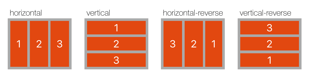
direction
决定子元素的排列方向,默认为 horizontal。
horizontal: 从左到右排列vertical: 从上到下排列horizontal-reverse: 从右到左排列vertical-reverse: 从下到上排列
{"layout":{"vars":{"direction":["horizontal","vertical","horizontal-reverse","vertical-reverse"]},"style":{"spacing":25,"padding":15,"width":600},"children":[{"repeat":"${direction.count}","style":{"direction":"vertical","flex-grow":1,"flex-basis":0,"spacing":2},"children":[{"type":"text","style":{"margin-left":4,"font-size":16,"font-name":"HelveticaNeue-Thin","text":"${direction[_index_]}"}},{"style":{"background-color":"#aaa","padding":5,"spacing":5,"height":100,"flex-grow":1,"direction":"${direction[_index_]}","align-items":"stretch"},"children":[{"repeat":3,"type":"text","style":{"flex-grow":1,"text":"${_index_ + 1}","font-size":20,"alignment":"center","background-color":"#E24810","color":"white"}}]}]}]}}
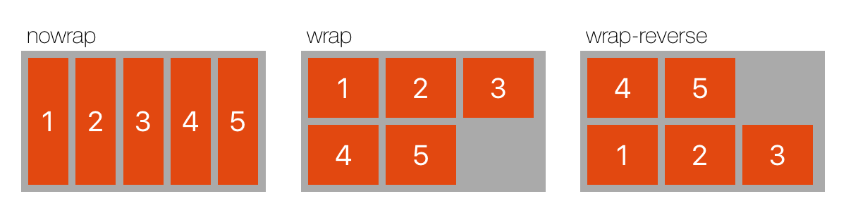
wrap
子元素是否允许换行。
nowrap: 子元素超出容器时,所有子元素按照 flex-shrink 缩小。wrap: 子元素超出容器时将换行。wrap-reverse: 子元素超出容器时将换行,方向与wrap相反。
{"layout":{"vars":{"wrap":["nowrap","wrap","wrap-reverse"]},"style":{"spacing":25,"padding":15,"width":600},"children":[{"repeat":"${wrap.count}","style":{"direction":"vertical","flex-grow":1,"flex-basis":0,"spacing":2},"children":[{"type":"text","style":{"margin-left":4,"font-size":16,"font-name":"HelveticaNeue-Thin","text":"${wrap[_index_]}"}},{"style":{"background-color":"#aaa","padding":5,"spacing":5,"line-spacing":5,"height":100,"flex-grow":1,"wrap":"${wrap[_index_]}","align-items":"stretch"},"children":[{"repeat":5,"type":"text","style":{"width":50,"text":"${_index_ + 1}","font-size":20,"alignment":"center","background-color":"#E24810","color":"white"}}]}]}]}}
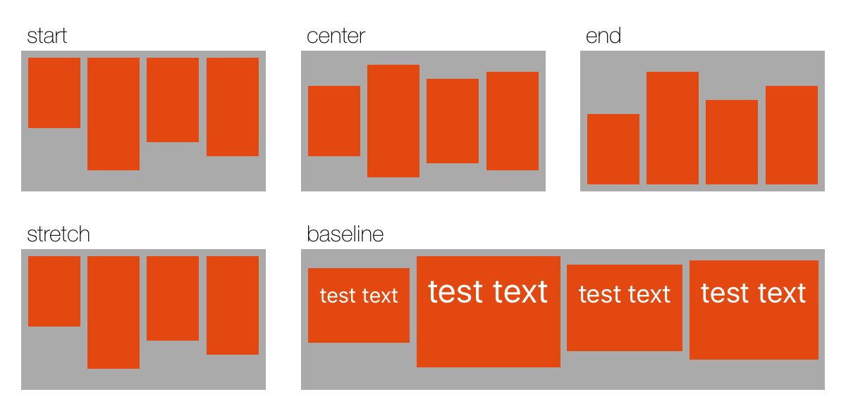
align-items
子元素在当前行的排列方向的垂直方向上的对齐方式。
每个子元素的
align-self属性可重写align-items属性。
start: 元素位于容器的开头center: 元素位于容器的中心end: 元素位于容器的结尾stretch: 默认值。元素拉伸以填满容器baseline: 根据元素的基线位置对齐。文本的基线为第一行文字的基线,容器的基线为其第一个元素的基线。
{"layout":{"vars":{"alignItems":["start","center","end","stretch","baseline"]},"style":{"width":600,"items-per-line":3,"wrap":true,"spacing":25,"line-spacing":20,"padding":15},"children":[{"repeat":"${alignItems.count}","vars":{"isBaseline":"${_index_ == 4}"},"style":{"direction":"vertical","flex-basis":"${isBaseline ? 25 : 0}","flex-grow":"${isBaseline ? 2 : 1}","spacing":2},"children":[{"type":"text","style":{"margin-left":4,"font-size":16,"font-name":"HelveticaNeue-Thin","text":"${alignItems[_index_]}"}},{"vars":{"items":[50,80,60,70]},"style":{"background-color":"#aaa","padding":5,"spacing":5,"line-spacing":5,"height":100,"flex-grow":1,"align-items":"${alignItems[_index_]}"},"children":[{"repeat":"${items}","type":"text","style":{"text":"${isBaseline ? 'test text' : ''}","flex-grow":1,"height":"${isBaseline ? 'auto' : _item_}","padding-top":10,"padding-bottom":"${isBaseline ? _item_ * 0.5 : 0}","font-size":"${isBaseline ? _item_ * 0.3 : 0}","alignment":"center","background-color":"#E24810","color":"white"}}]}]}]}}
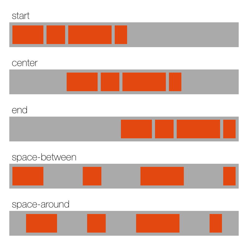
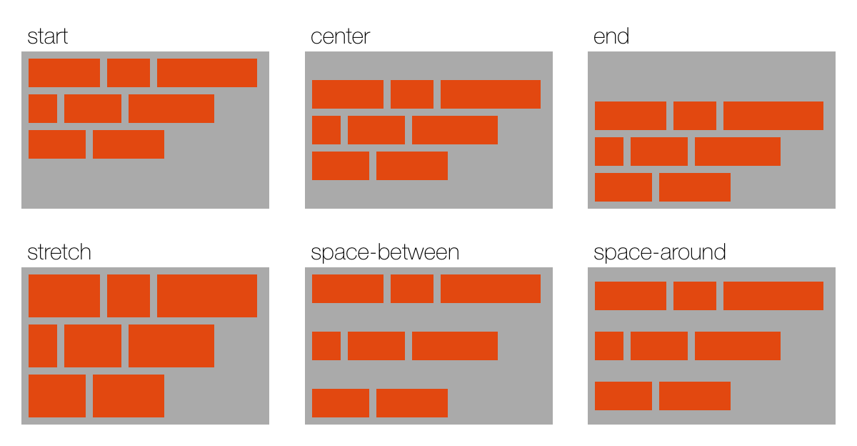
justify-content
子元素在布局方向上的对齐方式。
start: 默认值。元素位于容器的开头end: 元素位于容器的结尾center: 元素位于容器的中心space-between: 所有子元素均匀分布在行内,空白平均分布在每两个元素中间,首尾元素对齐到容器两端space-around: 所有子元素均匀分布在行内,空白平均分布在所有元素两侧
{"layout":{"vars":{"justifyContent":["start","center","end","space-between","space-around"]},"style":{"direction":"vertical","width":400,"spacing":15,"padding":15},"children":[{"repeat":"${justifyContent.count}","style":{"direction":"vertical","spacing":2},"children":[{"type":"text","style":{"margin-left":4,"font-size":16,"font-name":"HelveticaNeue-Thin","text":"${justifyContent[_index_]}"}},{"vars":{"items":[50,30,70,20]},"style":{"background-color":"#aaa","padding":5,"spacing":5,"line-spacing":5,"flex-grow":1,"justify-content":"${justifyContent[_index_]}"},"children":[{"repeat":"${items}","style":{"width":"${_item_}","height":30,"background-color":"#E24810"}}]}]}]}}
align-content
容器内各行的对齐方式
start: 行位于容器的开头end: 行位于容器的结尾center: 行位于容器的中心stretch: 默认值。行拉伸以填满容器space-between: 所有行均匀分布在容器内,空白平均分布在每两行中间,首尾行对齐到容器两端space-around: 所有行均匀分布在容器内,空白平均分布在所有行两侧
{"layout":{"vars":{"alignContent":["start","center","end","stretch","space-between","space-around"]},"style":{"width":600,"items-per-line":3,"wrap":true,"spacing":25,"line-spacing":20,"padding":15},"children":[{"repeat":"${alignContent.count}","style":{"direction":"vertical","flex-basis":0,"flex-grow":1,"spacing":2},"children":[{"type":"text","style":{"margin-left":4,"font-size":16,"font-name":"HelveticaNeue-Thin","text":"${alignContent[_index_]}"}},{"vars":{"items":[50,30,70,20,40,60,40,50]},"style":{"height":110,"wrap":true,"background-color":"#aaa","padding":5,"spacing":5,"line-spacing":5,"align-content":"${alignContent[_index_]}"},"children":[{"repeat":"${items}","style":{"width":"${_item_}","min-height":20,"background-color":"#E24810"}}]}]}]}}
align-self
覆写父元素的 align-items,指定元素在父元素中(沿父元素布局方向)的对齐方式,取值同 align-items。
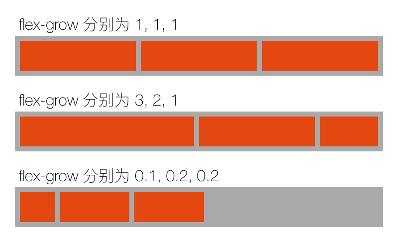
flex-grow
元素放大的权值,默认值为 0(即元素不会被放大)。不能为负数。
当容器的空间(在布局方向上)有剩余时,所有子元素(在布局方向上)的尺寸会放大以填满剩余空间,flex-grow 决定元素放大的权值。见 flex-basis。
当所有子元素的 flex-grow 总和小于 1 时,总权值按 1 计算,即剩余空间不会被填满,如下图第 3 行。
{"layout":{"vars":{"flexGrow":[[1,1,1],[3,2,1],[0.1,0.2,0.2]]},"style":{"direction":"vertical","width":400,"spacing":15,"padding":15},"children":[{"repeat":"${flexGrow}","style":{"direction":"vertical","spacing":2},"children":[{"type":"text","style":{"margin-left":4,"font-size":16,"font-name":"HelveticaNeue-Thin","text":"flex-grow 分别为 ${_item_.join(', ')}"}},{"style":{"background-color":"#aaa","padding":5,"spacing":5,"line-spacing":5,"flex-grow":1},"children":[{"repeat":"${_item_}","style":{"flex-grow":"${_item_}","height":30,"background-color":"#E24810"}}]}]}]}}
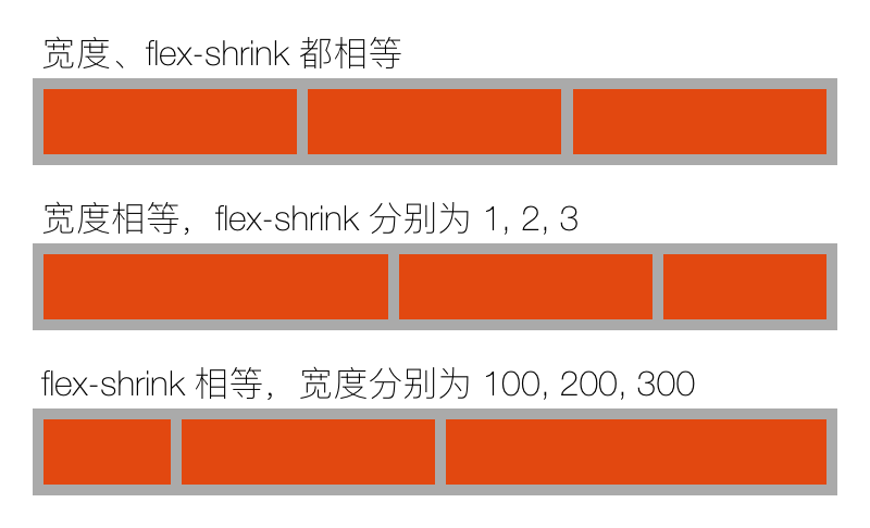
flex-shrink
元素缩小的权值,默认值为 1。不能为负数。
当容器的空间不足以放下所有子元素时,所有子元素的大小会缩小以填满剩余空间。
元素的 flex-basis 也会计入权值,即实际权值为 flex-shrink * flex-basis 。
默认值为 1,也就是说,当空间不足时,所有元素等比缩小。
像图标、头像之类的元素,一般是不允许缩小的,这时记得将 flex-shrink 设置为 0 。
{"layout":{"vars":{"items":[{"desc":"宽度、flex-shrink 都相等","width":[200,200,200],"flexShrink":[1,1,1]},{"desc":"宽度相等,flex-shrink 分别为 1, 2, 3","width":[200,200,200],"flexShrink":[1,2,3]},{"desc":"flex-shrink 相等,宽度分别为 100, 200, 300","width":[100,200,300],"flexShrink":[1,1,1]}]},"style":{"direction":"vertical","width":400,"spacing":15,"padding":15},"children":[{"repeat":"${items}","vars":{"item":"${_item_}"},"style":{"direction":"vertical","spacing":2},"children":[{"type":"text","style":{"margin-left":4,"font-size":16,"font-name":"HelveticaNeue-Thin","text":"${_item_.desc}"}},{"style":{"background-color":"#aaa","padding":5,"spacing":5,"line-spacing":5,"flex-grow":1},"children":[{"repeat":"${item.width.count}","style":{"width":"${item.width[_index_]}","flex-shrink":"${item.flexShrink[_index_]}","height":30,"background-color":"#E24810"}}]}]}]}}
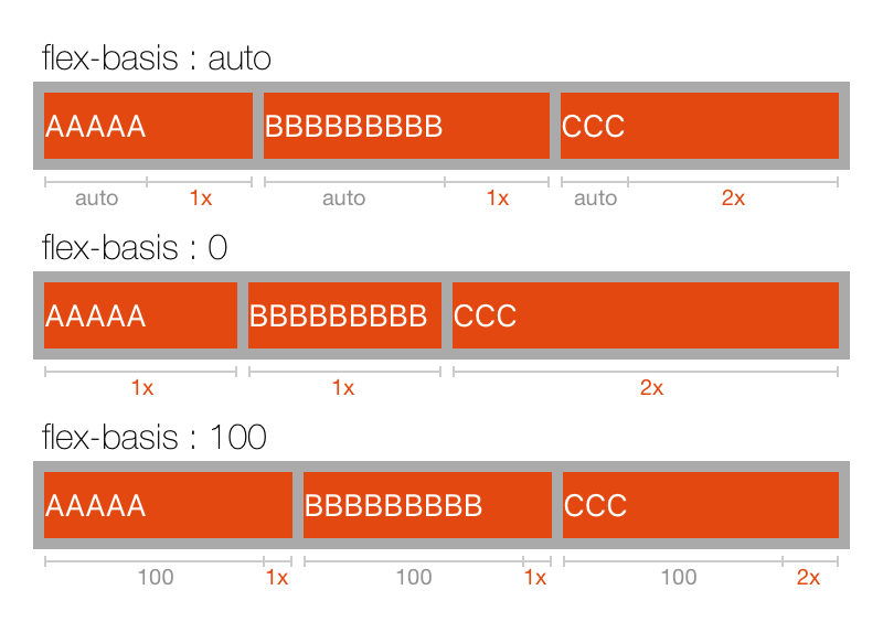
flex-basis
元素伸缩时的基准尺寸。容器计算剩余空间时,使用子元素的基准尺寸来计算已分配空间。默认值为 auto。
auto: 取 width/height 的值(取决于父容器的布局方向)content: 取元素的内容尺寸length: 设置固定的尺寸或百分比
如下图,3个子元素的 flex-grow 分别为 1, 1, 2 ,先根据每个元素的 flex-basis 计算各自的基本尺寸,再将剩余空间按权值分配给每个元素。
{"layout":{"vars":{"flexBasis":["auto",0,100]},"style":{"direction":"vertical","width":400,"spacing":25,"padding":15},"children":[{"repeat":"${flexBasis}","vars":{"value":"${_item_}"},"style":{"direction":"vertical","spacing":2},"children":[{"type":"text","style":{"margin-left":4,"font-size":16,"font-name":"HelveticaNeue-Thin","text":"flex-basis : ${_item_}"}},{"style":{"background-color":"#aaa","padding":5,"spacing":5,"line-spacing":5,"flex-grow":1},"children":[{"repeat":"${['AAAAA', 'BBBBBBBBB', 'CCC']}","type":"text","style":{"text":"${_item_}","flex-basis":"${value}","color":"white","flex-grow":"${_index_ == 2 ? 2 : 1}","height":30,"background-color":"#E24810"}}]}]}]}}
扩展属性
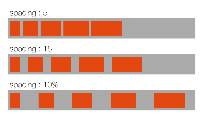
spacing
子元素间的间距。
为每两个子元素之间添加间距,每行的第一个元素之前和最后一个元素之后不会添加。
{"layout":{"vars":{"spacing":[5,15,"10%"]},"style":{"direction":"vertical","width":400,"spacing":10,"padding":15},"children":[{"repeat":"${spacing}","vars":{"value":"${_item_}"},"style":{"direction":"vertical","spacing":2},"children":[{"type":"text","style":{"margin-left":4,"font-size":16,"font-name":"HelveticaNeue-Thin","text":"spacing : ${_item_}"}},{"style":{"background-color":"#aaa","padding":5,"spacing":"${_item_}","flex-grow":1},"children":[{"repeat":"${[20, 30, 40, 50, 60]}","style":{"width":"${_item_}","height":30,"background-color":"#E24810"}}]}]}]}}
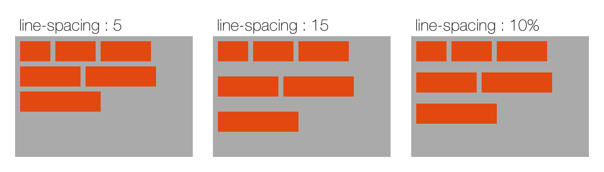
line-spacing
多行布局的行间距。
为每两行之间添加间距,跟 spacing 相似。
{"layout":{"vars":{"lineSpacing":[5,15,"10%"]},"style":{"width":600,"spacing":20,"padding":15},"children":[{"repeat":"${lineSpacing}","vars":{"value":"${_item_}"},"style":{"direction":"vertical","spacing":2},"children":[{"type":"text","style":{"margin-left":4,"font-size":16,"font-name":"HelveticaNeue-Thin","text":"line-spacing : ${_item_}"}},{"style":{"height":120,"wrap":true,"align-content":"start","background-color":"#aaa","padding":5,"spacing":5,"line-spacing":"${_item_}","flex-grow":1},"children":[{"repeat":"${[30, 40, 50, 60, 70, 80]}","style":{"width":"${_item_}","height":20,"background-color":"#E24810"}}]}]}]}}
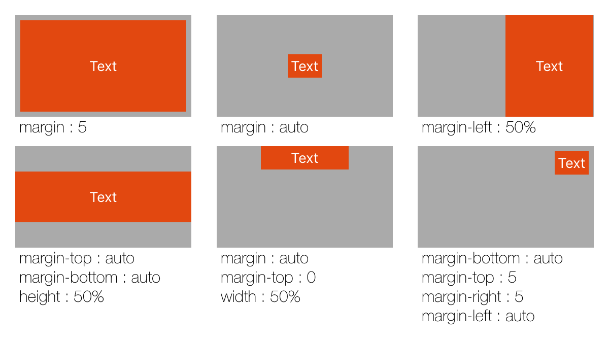
fixed
是否为固定布局元素,固定元素不参与弹性布局,也不会对父容器的布局有任何影响,而是直接相对于父元素布局(等其它弹性元素布局完成之后再布局)。fixed 元素通过 width, height, margin 属性来确定元素的位置与大小。
适合用于浮层、角标等元素。默认情况下(不设置 width, height, margin),一个 fixed 元素就是和父容器等大的一个浮层,也可以放置于容器底部作为背景。
fixed 元素并不是一定处于其它元素的最上方,而是同其它元素一样,按照其在父容器里的顺序排列。
{"layout":{"vars":{"items":[{"margin":5},{"margin":"auto"},{"margin-left":"50%"},{"margin-top":"auto","margin-bottom":"auto","height":"50%"},{"margin":"auto","margin-top":0,"width":"50%"},{"margin-left":"auto","margin-bottom":"auto","margin-top":5,"margin-right":5}]},"style":{"wrap":true,"items-per-line":3,"width":600,"spacing":25,"line-spacing":10,"padding":15},"children":[{"repeat":"${items}","vars":{"value":"${_item_}"},"style":{"flex-grow":1,"flex-basis":0,"direction":"vertical"},"children":[{"style":{"height":100,"background-color":"#aaa"},"children":[{"type":"text","style":{"fixed":true,"text":"Text","alignment":"center","color":"white","padding":3,"width":"${_item_.width}","height":"${_item_.height}","margin":"${_item_.margin}","margin-top":"${_item_['margin-top']}","margin-left":"${_item_['margin-left']}","margin-bottom":"${_item_['margin-bottom']}","margin-right":"${_item_['margin-right']}","background-color":"#E24810"}}]},{"type":"text","style":{"margin-left":4,"font-size":16,"font-name":"HelveticaNeue-Thin","lines":0,"text":"${_item_.allKeys.select(k -> k + ' : ' + _item_[k]).join('\\n')}"}}]}]}}


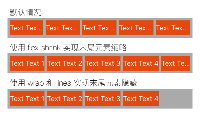
lines
仅对多行容器有效(即 wrap 不为 nowrap),限制最大行数。默认为 0,即不限制行数。
可以用来隐藏放不下的元素,如下图第 3 行
{"layout":{"style":{"direction":"vertical","width":400,"spacing":10,"padding":15},"children":[{"style":{"direction":"vertical","spacing":2},"children":[{"type":"text","style":{"margin-left":4,"font-size":16,"font-name":"HelveticaNeue-Thin","text":"默认情况"}},{"style":{"background-color":"#aaa","padding":5,"spacing":5},"children":[{"repeat":5,"type":"text","style":{"text":"Text Text ${_index_ + 1}","color":"white","height":30,"background-color":"#E24810"}}]}]},{"style":{"direction":"vertical","spacing":2},"children":[{"type":"text","style":{"margin-left":4,"font-size":16,"font-name":"HelveticaNeue-Thin","text":"使用 flex-shrink 实现末尾元素缩略"}},{"style":{"background-color":"#aaa","padding":5,"spacing":5},"children":[{"repeat":5,"type":"text","style":{"text":"Text Text ${_index_ + 1}","flex-shrink":"${pow(1000, _index_)}","color":"white","height":30,"background-color":"#E24810"}}]}]},{"style":{"direction":"vertical","spacing":2},"children":[{"type":"text","style":{"margin-left":4,"font-size":16,"font-name":"HelveticaNeue-Thin","text":"使用 wrap 和 lines 实现末尾元素隐藏"}},{"style":{"background-color":"#aaa","padding":5,"spacing":5,"wrap":"wrap","lines":1},"children":[{"repeat":5,"type":"text","style":{"text":"Text Text ${_index_ + 1}","color":"white","height":30,"background-color":"#E24810"}}]}]}]}}
items-per-line
仅对多行容器有效(即 wrap 不为 nowrap),限制每行最大元素个数。默认为 0,即不限制。
单位与百分比
元素的尺寸、边距等属性可以直接指定为一个数字,如 "width": 100,也可以使用百分比和单位,如 "50%", "1px", "100vw"。
百分比
百分比表示其最终值是相对于父容器的宽度或高度(减去padding),以下属性支持使用百分比指定:
width相对于父容器的宽度。height相对于父容器的高度。min-width等 同width/height。flex-basis相对于父容器在布局方向上的尺寸。margin、padding相对于父容器的宽度。spacing相对于父容器在布局方向上的尺寸。line-spacing相对于父容器在布局方向的垂直方向上的尺寸。
单位
不带单位时使用系统原生的单位。支持以下单位:
px 物理像素,一般用于一像素的分割线或边框。注意与 css 中的 px 不同。mm、cm、vw 等单位详见 FlexLayout.h 文件定义。